
Color speaks volumes, so can the perfect wedding palette. It can soothe our souls, stimulate our senses—even affect our mood. We deeply connect with color on emotional, physical, and cultural levels. Take a look in your closet and odds are, it is dominated by a certain signature color. One of the most powerful design elements, color, can be the thread that ties an entire wedding experience together. The colors you choose reflect your personality as a couple. Are you a dangerous or romantic red or its polar opposite—an elegant, natural green? Do you have strong cultural ties to color? No matter what your style is, it is important to choose your color palette with your heart. Forget the fads—go with something you love (like your fiancé!). Once you have made your choices, how can you be sure that the colors will work well together? Much like music, the key to fabulous color is harmony. Not confident with color? No worries—follow these simple steps to choosing a color palette that will take your wedding from ordinary to extraordinary.
One way to make yourself stand out from the crowd is by using color in ways nobody else thought of. Josef Albers
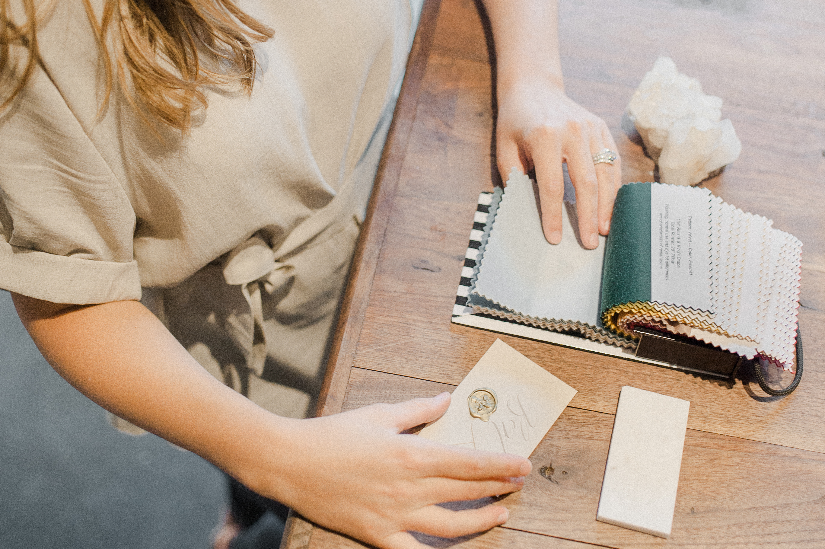
photo by hannah forsberg
Color Considerations
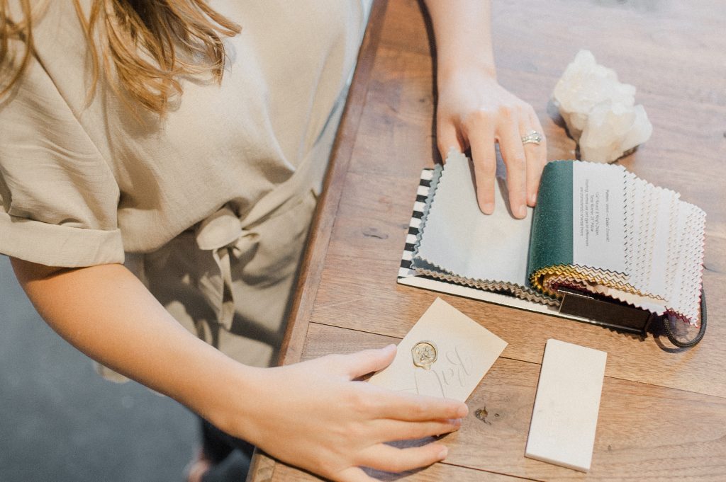
1. Start With Something You Love – Start with a favorite photo, an object, a romantic place. My daughter’s entire wedding palette started with a shared Irish heritage and a bouquet of flowers. Soon after their engagement, my daughter found her perfect color palette in a bouquet of flowers in shades of orange and green, the colors of the Irish flag. I actually matched the colors of the leaves and flowers with my Pantone swatch book. Another couple we worked with got their color inspiration from a photo of the Sagrada Familia that they took while on a romantic vacation.
2. Consider the Season – Factor in any seasonal colors when making your choices (will the church be filled with poinsettias, etc.). Also, make sure that your favorite flowers are available during that time of year. Though anything can be flown in these days, using in-season blooms is much more economical.
3. Look to Your Venue – What is the style of your venue and what colors already exist in the space? What type/color of lighting will you use?
4. Look to Your Fashion – Will you be wearing a colored dress or will you or your partner be wearing an accent color?
5. Look to Your Culture – Is there a color that is culturally significant to you or your family?
6. Look to Your Personality as a Couple – Colors have temperature. Are you warm (like red, yellow, orange) or cool (like blue, green, purple)? Color also has intensity. Are you light and airy (pastel or muted tones), regal (dark and intense) or earthy (neutrals)?
7. Go With Your Tried & True Favorite Color – This one is easy if you already have a signature color! We will help you find an accent.
Now that these decisions are made, narrow the field down to one or two main colors.You can choose more if you would like, but we recommend that you use these as accent colors.
Creating Color Harmony
Colors in their natural order create the simplest color harmony, like the rainbow. Thus, the closer colors are on the color wheel, the more harmonious they are. The further away you get, the more contrast created. Contrast is the drama queen of design, and when done right, can be very striking.
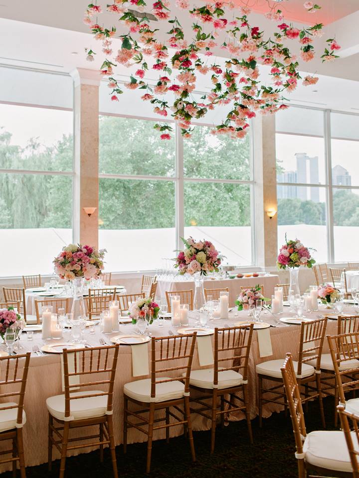
photo by amy arrington photography
Designer Secret I: Complementary Colors – Locate your two colors on the color wheel above. If they are complementary colors—direct opposites on the color wheel, you will want to make a few adjustments. A complimentary color scheme will give you strong contrast, which can be gorgeous. Choose wisely though, as direct complements can actually make your eyes vibrate. If you notice that your colors are making your eyes buzz, try one of these tricks of the trade:
- 80/20 Rule – Make one color dominant (80%) and the other an accent (20%).
- Tint or Shade – Choose a main color and then use a tint (lighter version of a color) or a shade (darker version of a color) of its complementary color.
- Tame the Buzz – Choose a second color that is close to or directly next to your main color’s complement on the color wheel.
- Harmonizing an Expanded Palette – Want more than two colors? Start with your two complements. Then, add a tint or a shade of each complement as accents. Throw in a saturated or dull version of each as well. Now comes the WOW. Choose a color that is two or three spots over on the color wheel from one of the complements.
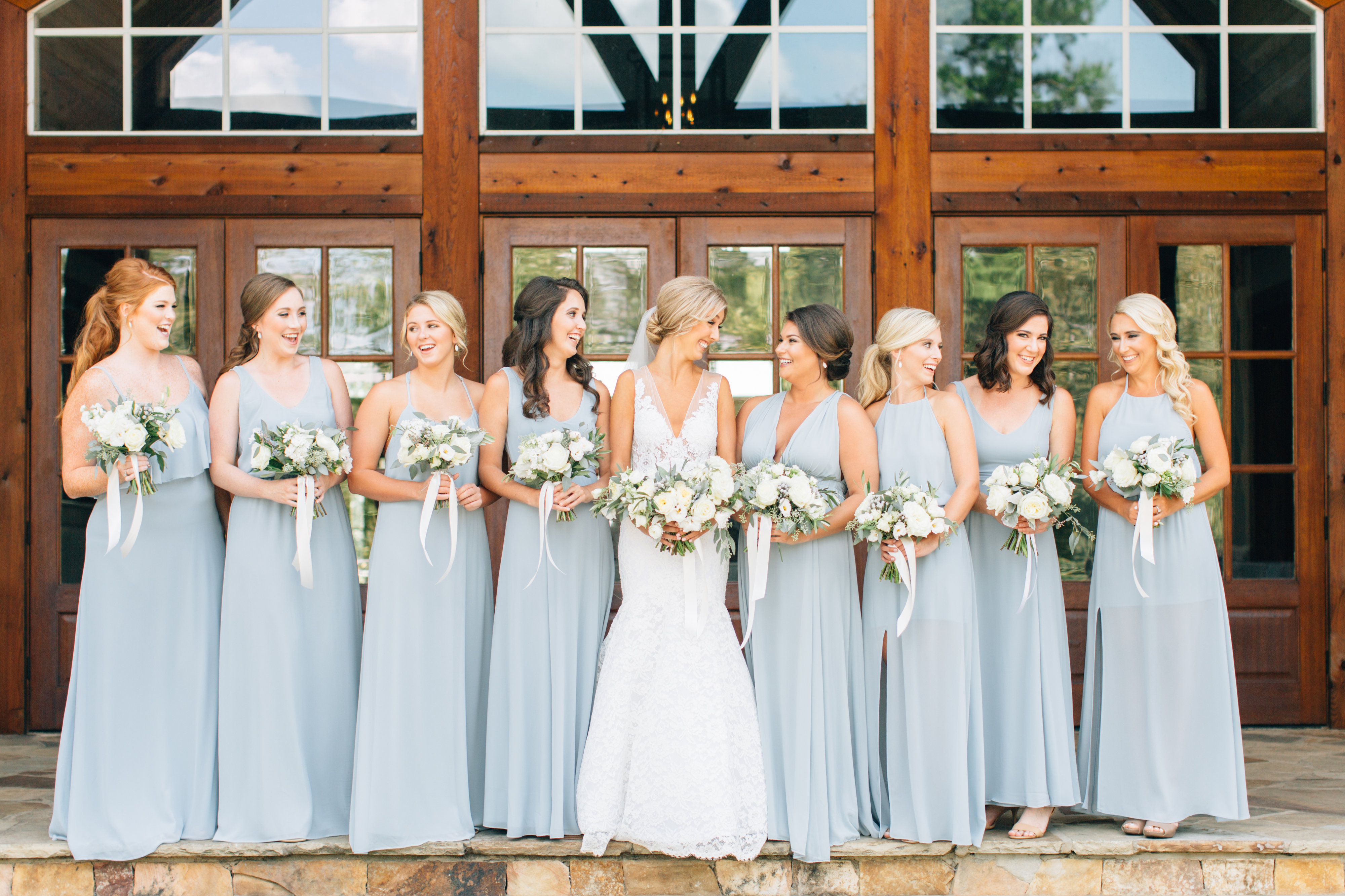
photo by 4corners photography
Designer Secret II: Random Colors – For example, your dream has been a blush wedding—it is your signature color. Your partner, an avid Anaheim Ducks fan, wants to use the team colors. You are horrified. How on earth is this going to work? Just take a page out of Mother Nature’s playbook—she is a master at this. Try one of these random color-mixing solutions:
- Mimic Nature – Make one color dominant and the others accent.
- Mix Values – Use tints or shades of some of the colors.
- Vary the Saturation – Choose a muted or grayed version of the colors. Team colors are often in-your-face. Muting the colors raises the level of sophistication.
-
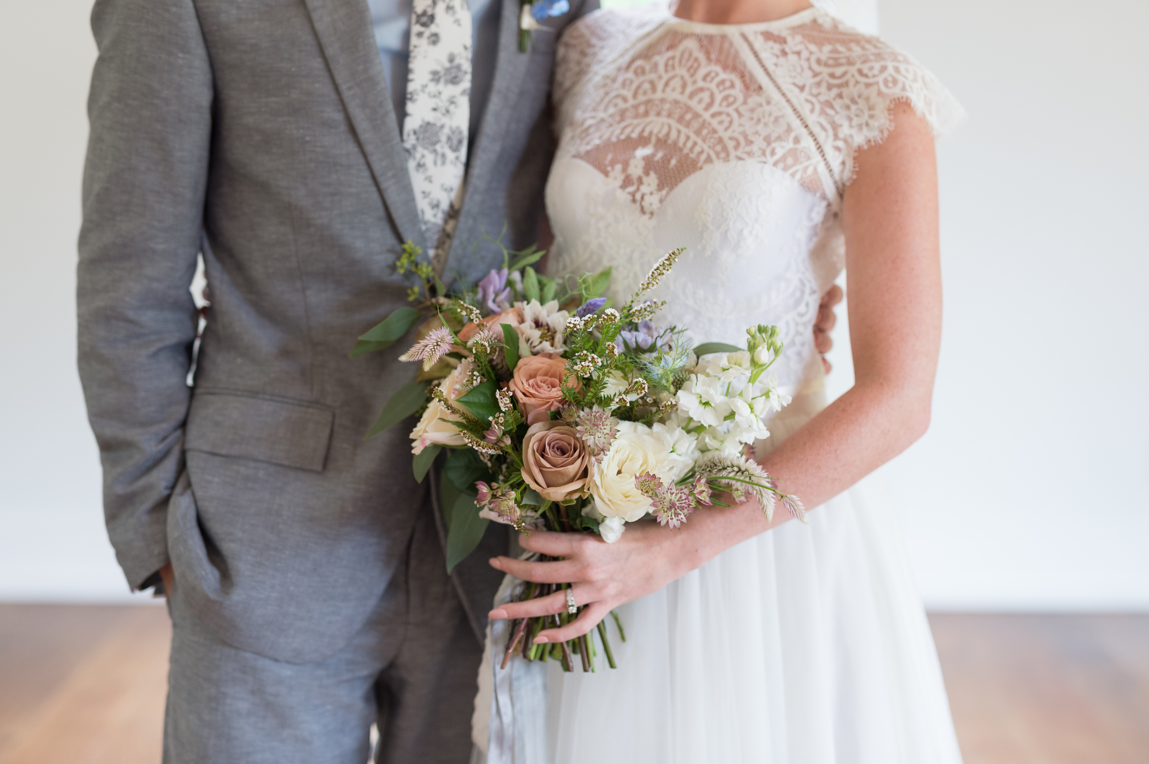
photo by laura barnes photography
Color Resources
Now that you are armed and dangerous with all of this color expertise, you need to collect some color inspiration from which to pull your palette. Here is a list of our favorite sources of color.
DIY/Hands-On Color Resources
- Color chips from paint & home stores
- Nature (grab your camera and look closely)
- Magazines (home & design magazines always have special color issues)
- Fine art/museums
- Travel (again, grab your camera and look closely)
Resources /Apps
Websites


